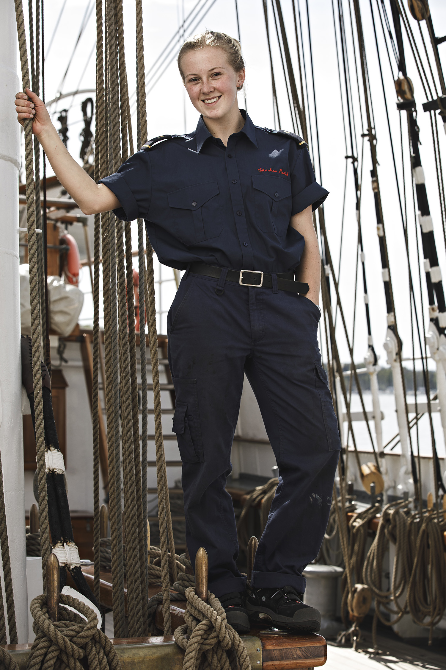
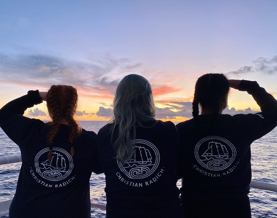
Christian Radich
Branding
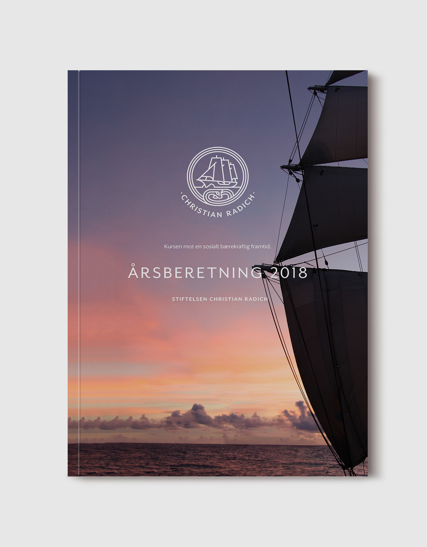
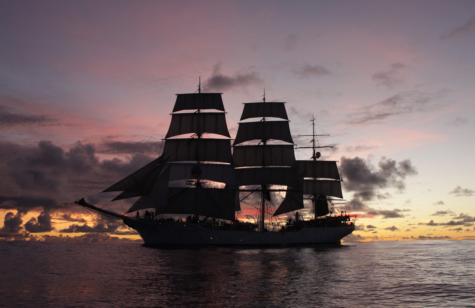
Making the sea exciting and accessible for new generations with the full rigged ship, Christian Radich.
Christian Radich is a big a part of Norway’s maritime cultural heritage, being only one of three fullriggers in the country. They needed an updated and coherent identity to take them into the 21 century.
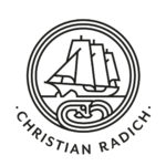
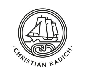
New logo
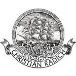
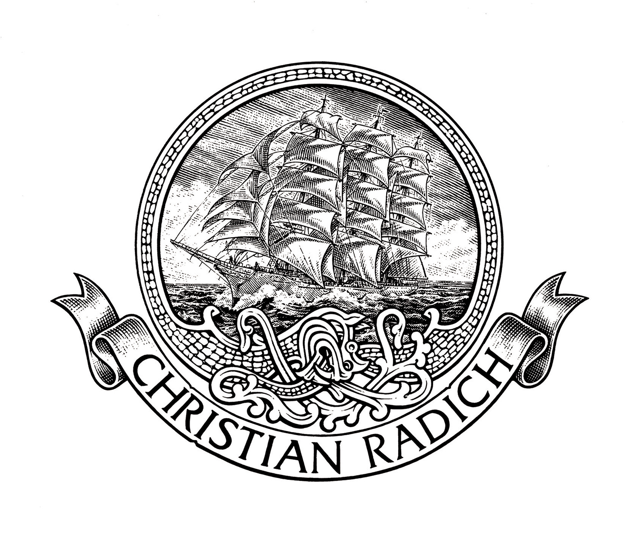
Old logo
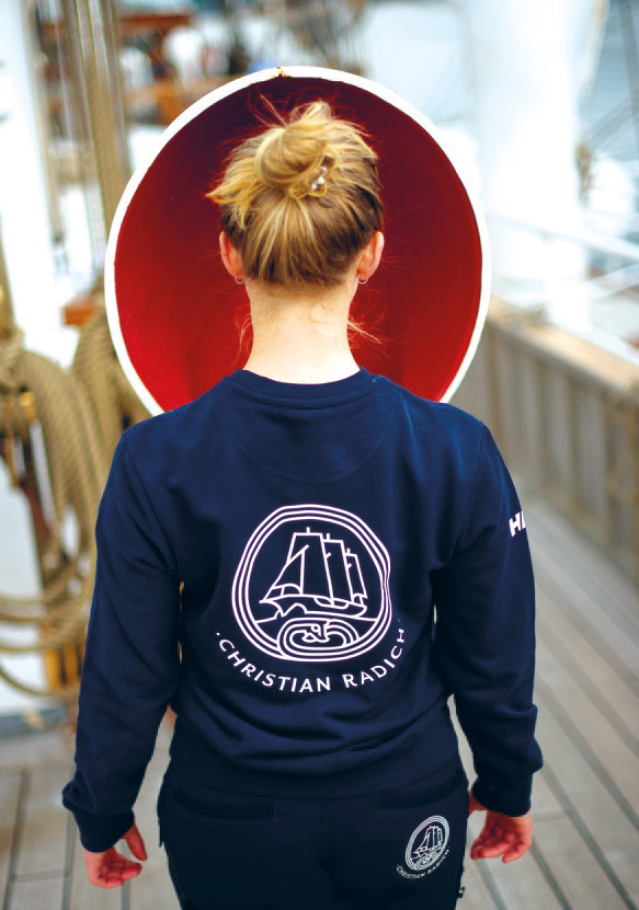
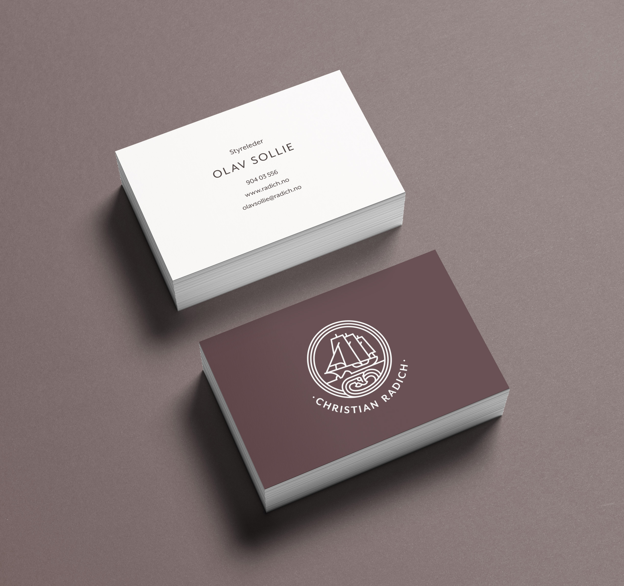
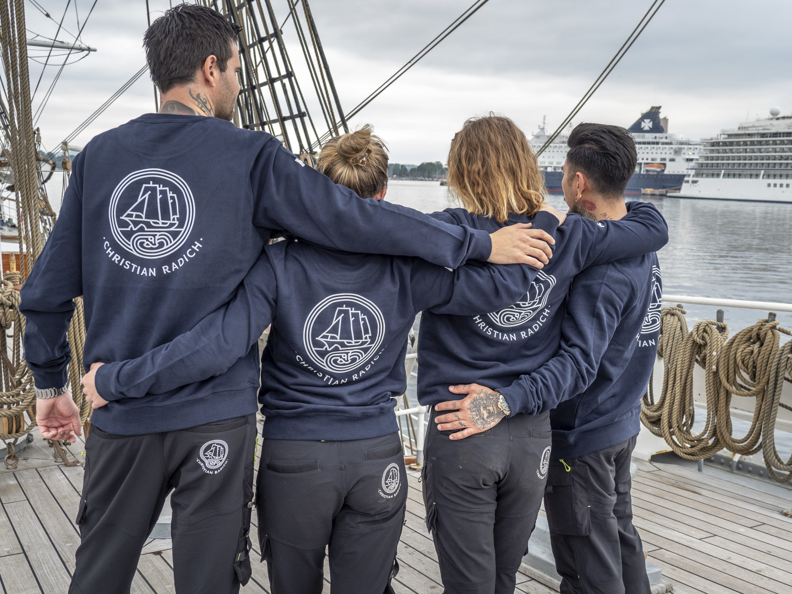
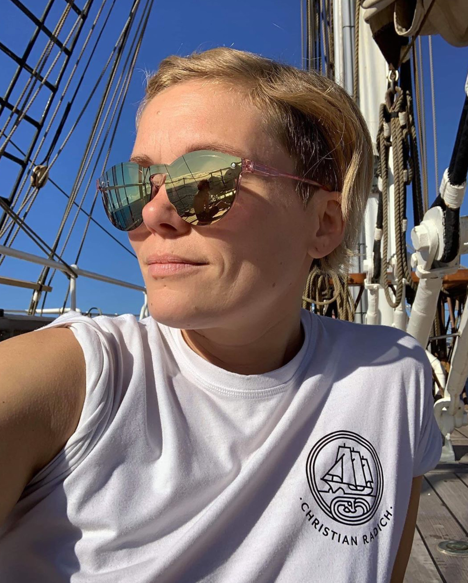
The importance of a logo that will work on all formats, big or small, is key when branding a ship, because the logo could be printet on everything from a pin to the main sail.
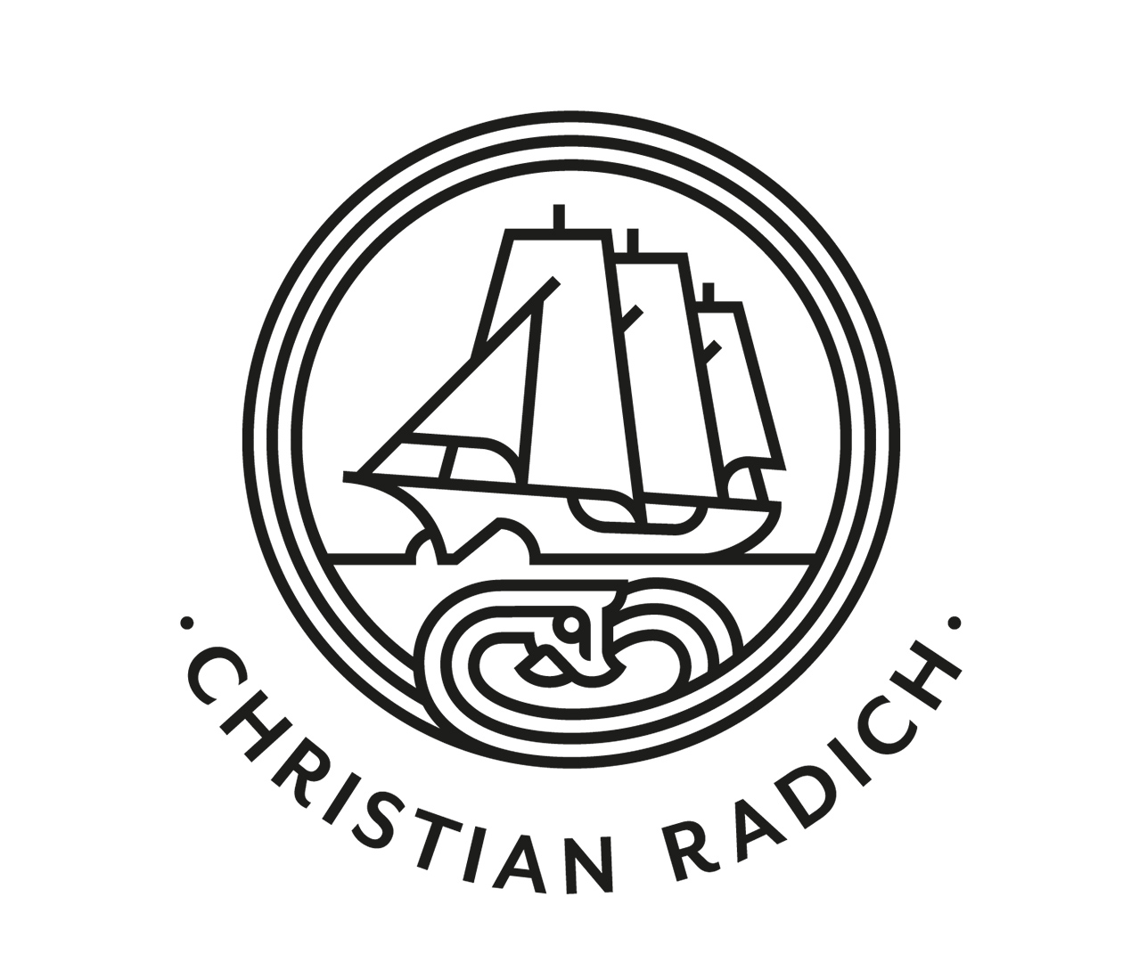
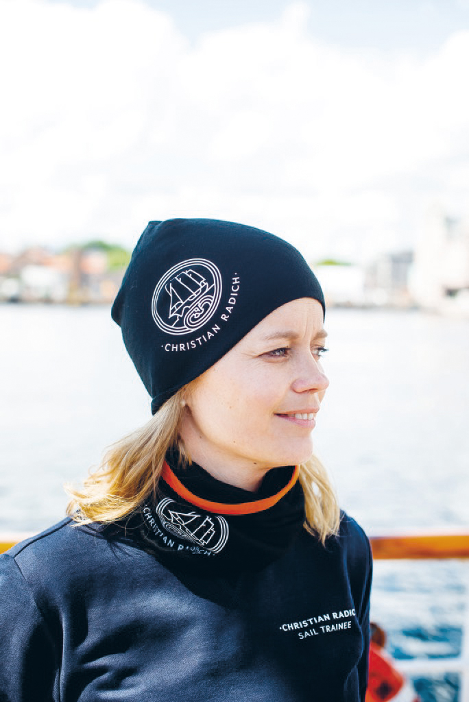
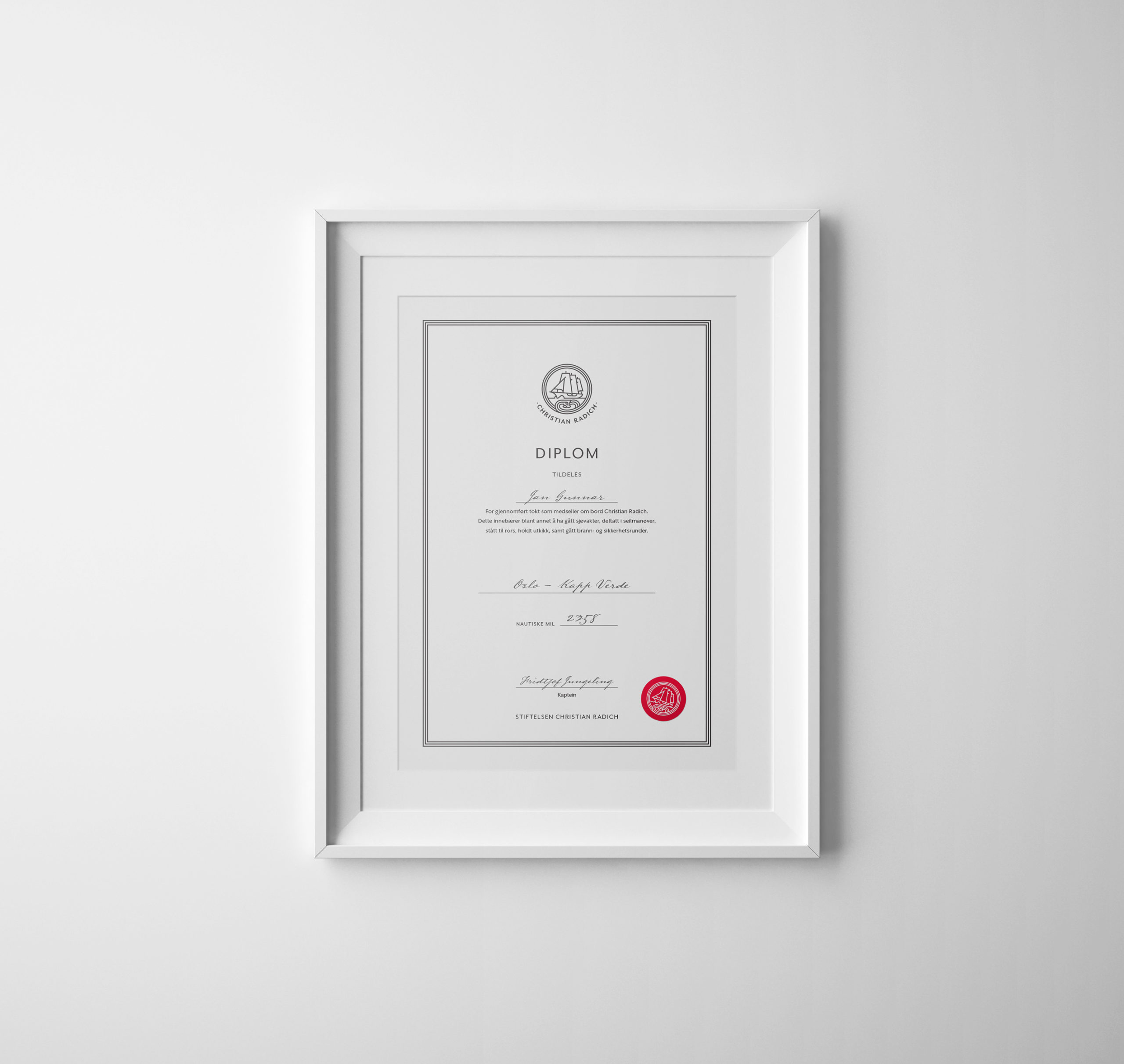
The brand typeface, Mrs. Eaves, reflects the shapes in the logo symbol while matching the identity of the brand.


The color palette is based on the ship’s own colors, with dark wooden tones, offwhite sails and brass railings.